Examples
These examples show use cases and scenarios for pudu. Most examples use spectroscopic data, and some of them complement with images to show 2-D capability. The later data is the MNIST database and it downloads from the code itself using keras. The spectral data, parameters, and sample models can be found on the data folder included in the examples folder from the repository. To make sure you comply with all the libraries used in these examples, please use the additional requirements included in examples/examples_requirements.txt.
Example 1: PC-LDA with Scikit-learn for classification of spectroscopic data
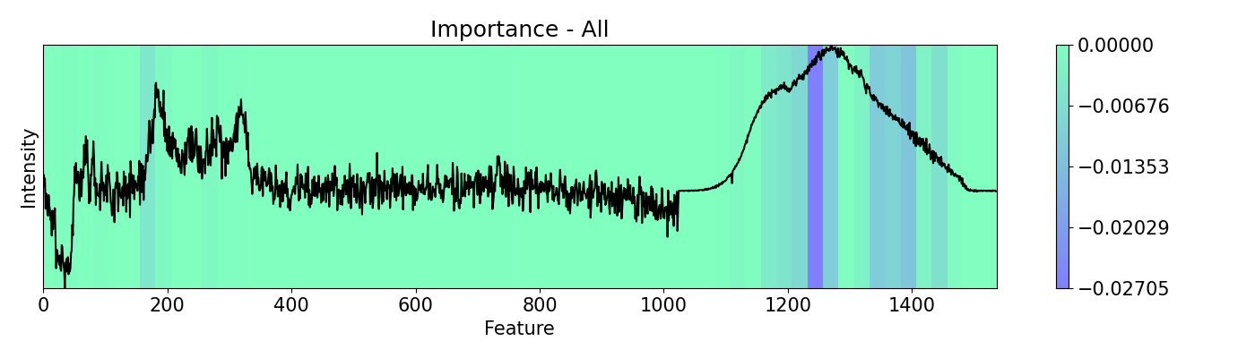
In this example, a PC-LDA cascaded algorithm built with Scikit-learn is evaluated using LIME and pudu. The data set used by the model are Raman and Photoluminescence spectras merged into a single vector as features and performance as open circuit voltage (Voc) data as target for classification. These are measured from CIGSe photovoltaic cells from a combinatorial sample. pudu, in contrast to LIME, clearly highlights important sections of the spectras normally related to Voc.
1import matplotlib.pyplot as plt
2from lime import lime_tabular
3import spectrapepper as spep
4import numpy as np
5import pickle
6import lime
7
8from pudu import pudu, plots
9
10
11# Load features (spectra) and targets (open circuit coltage, voc)
12features = spep.load('examples/data/features.txt')
13targets = spep.load('examples/data/targets.txt', transpose=True)[2]
14
15x = features[100]
16
17# Load pre-trained LDA and PCA models
18lda = pickle.load(open('examples/data/lda_model.sav', 'rb'))
19pca = pickle.load(open('examples/data/pca_model.sav', 'rb'))
20
21### LIME ###
22# First we try LIME. then we try pudu and see the difference.
23# We need to wrap the probability function
24def pcalda_proba(X):
25 X = pca.transform(X)
26 return lda.predict_proba(X)
27
28# Feature names and categorical features in the correct format
29fn = [str(i) for i in range(len(x))]
30cf = [i for i in range(len(x))]
31
32# Make explainer and evaluate an instance
33explainer = lime.lime_tabular.LimeTabularExplainer(np.array(features),
34 mode='classification', feature_names=fn, categorical_features=cf, verbose=False)
35exp = explainer.explain_instance(x, pcalda_proba,
36 num_features=len(fn), num_samples=1000)
37
38# Reformat the output so it is in order to plot over the feature
39e = exp.as_list()
40lm = [0 for _ in range(1536)]
41for i in e:
42 lm[int(str.split(i[0], '=')[0])] = i[1]
43
44# Plot the result with the evaluated feature
45plt.rc('font', size=15)
46plt.subplots_adjust(left=0, bottom=0, right=1, top=1)
47plt.figure(figsize=(14, 4))
48plt.imshow(np.expand_dims(lm, 0), cmap='Greens', aspect="auto", interpolation='nearest',
49 extent=[0, 1536, min(x), max(x)], alpha=1)
50plt.plot(x, 'k')
51plt.colorbar(pad=0.05)
52plt.title('Lime')
53plt.xlabel('Feature')
54plt.ylabel('Intensity')
55plt.yticks([])
56plt.tight_layout()
57
58plt.show()
59
60### PUDU ###
61# Select x (feature) and respective y (target)
62x = x[np.newaxis, np.newaxis, :, np.newaxis]
63y = targets[100]
64
65# Input should be 4d: (batch * rows * columns * depth)
66# This is a classification problem, thus the output should be the
67# probability by category: [prob_1, prob_2, ..., prob_c]
68def pf(X):
69 X = X[0,:,:,0]
70 return lda.predict_proba(pca.transform(X))[0]
71
72# Build pudu
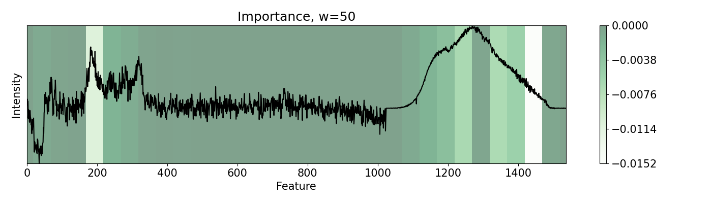
73imp = pudu.pudu(x, y, pf)
74
75# Evaluate `importance`. We use Vanilla settings for this one
76# except for `window`.
77imp.importance(window=1)
78plots.plot(imp.x, imp.imp, title="Importance, w=1", yticks=[], font_size=15)
79
80# Single pixels might be irrelevant for spectroscopy. We can group features
81# to evaluate together.
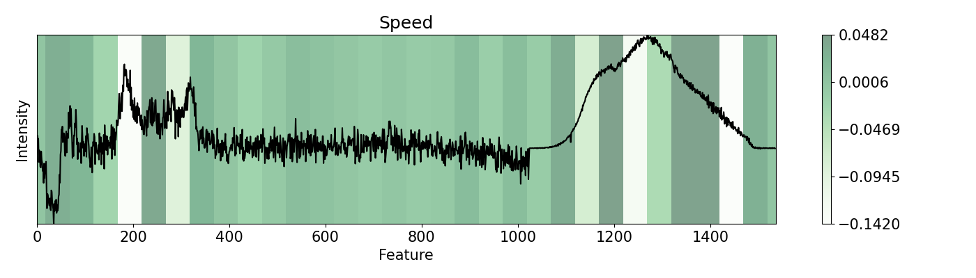
82imp.importance(window=50)
83plots.plot(imp.x, imp.imp, title="Importance, w=50", yticks=[], font_size=15)
84
85# We can see how fast would the classification change according to
86# the change in the features.
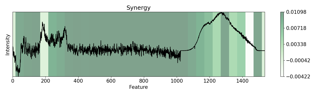
87imp.speed(window=50)
88plots.plot(imp.x, imp.spe, title="Speed", yticks=[], font_size=15)
89
90# Finally we evaluate how different changes complement each other.
91# We want ot evaluate the main Raman peak (aprox. 3rd position) and see
92# its synergy with the rest of the data
93imp.synergy(inspect=3, window=50)
94plots.plot(imp.x, imp.syn, title="Synergy", yticks=[], font_size=15)
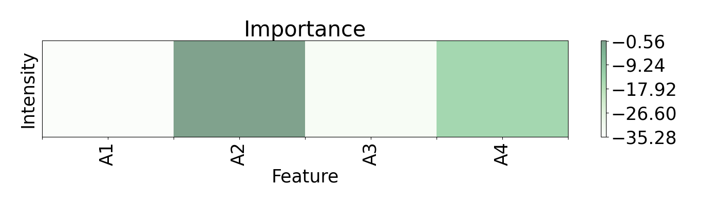
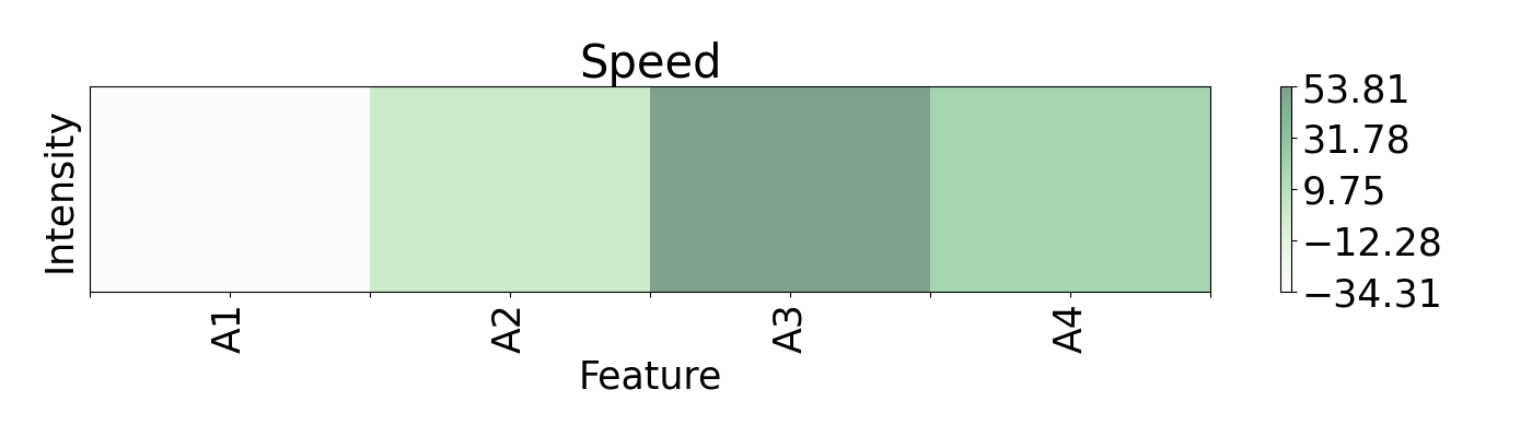
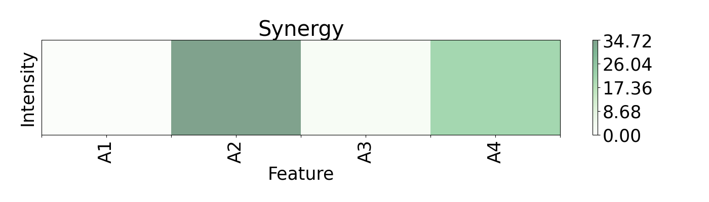
Example 2: Regression for predicition of open circuit voltage of solar cells with RBFN
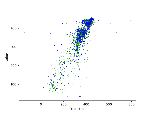
Regression can be an important method for spectroscopy, especially when specific values, beyond classification, are of interest. Here, a Radial Basis Function Network (RBFN) is trained with localreg to perform the prediction of open circuit voltage (Voc) with spectral areas calculated from Raman and Photoluminescence spectras. These data are obtained from photovoltaic CIGSe cells from a combinatorial sample. The example shows which of these areas have more impact in the prediction and also how they interact with each other.
from localreg import RBFnet
from sklearn.metrics import r2_score
import matplotlib.pyplot as plt
import spectrapepper as spep
import numpy as np

from pudu import pudu, plots
from pudu import perturbation as ptn

# Load the file that contains the calculated areas from the spectras
ra = spep.load('examples/data/areas.txt', transpose=True)

# Shuffleing and spearating into area type and train/test
ra0, ra1, ra2, ra3, voc = spep.shuffle([ra[0], ra[1], ra[2], ra[3], ra[4]])
ra0_te, ra1_te, ra2_te, ra3_te, voc_te = ra0[1494:], ra1[1494:], ra2[1494:], ra3[1494:], voc[1494:]
ra0_tr, ra1_tr, ra2_tr, ra3_tr, voc_tr = ra0[:1494], ra1[:1494], ra2[:1494], ra3[:1494], voc[:1494]

# Preparation, training, and testing of the RBNF
input = np.array([ra0_tr, ra1_tr, ra2_tr, ra3_tr]).T
z = voc_tr
net = RBFnet()
net.train(input, z, num=200, verbose=False)
z_hat = net.predict(input)
z_hat_te = net.predict(np.array([ra0_te, ra1_te, ra2_te, ra3_te]).T)
print('Train R2: ', round(r2_score(z, z_hat), 2), ' | Test R2: ', round(r2_score(voc_te, z_hat_te), 2))

# Plot the regression
plt.scatter(z_hat, z, s=1, c='green')
plt.scatter(z_hat_te, voc_te, s=1, c='blue')
plt.ylabel('Value')
plt.xlabel('Prediction')
plt.show()

### PUDU ###
# Wrap the probability function
def rbf_pred(X):
    X = X[0,0,:,0]
    return net.predict([X, X])[0]

# Formatting as (batch, rows, columns, depth)
x = input[0]
x = x[np.newaxis, np.newaxis, :, np.newaxis]
y = z[0]

# Build pudu and evaluate importance, speed, and synergy
imp = pudu.pudu(x, y, rbf_pred)
imp.importance(window=1, perturbation=ptn.Bidirectional(delta=0.1))
imp.speed(window=1, perturbation=[
                                  ptn.Bidirectional(delta=0.1),
                                  ptn.Bidirectional(delta=0.2),
                                  ptn.Bidirectional(delta=0.3)
                                ])
imp.synergy(window=1, inspect=0, perturbation=ptn.Bidirectional(delta=0.1))

# Plot the ouput
axis = [0, 0.5, 1, 1.5, 2, 2.5, 3, 3.5, 4]
ticks = ['', 'A1', '', 'A2', '', 'A3', '', 'A4', '']

plots.plot(imp.x, imp.imp, title="Importance", font_size=25, show_data=False,
            axis=axis, xticks=ticks)

plots.plot(imp.x, imp.spe, title="Speed", font_size=25, show_data=False,
            axis=axis, xticks=ticks)

plots.plot(imp.x, imp.syn, title="Synergy", font_size=25, show_data=False,
            axis=axis, xticks=ticks)
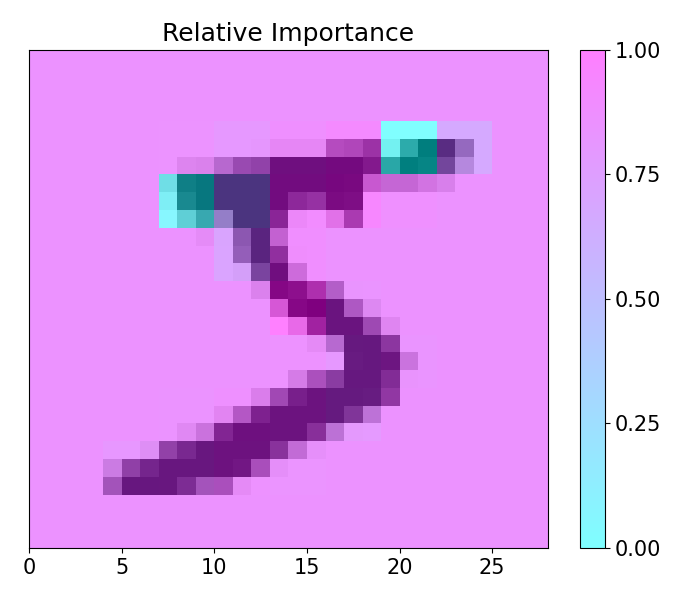
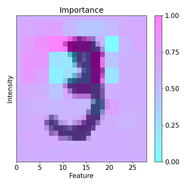
Example 3: Handwritten numbers recognition using CNN with Keras and Mnist
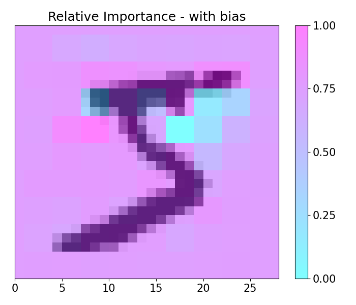
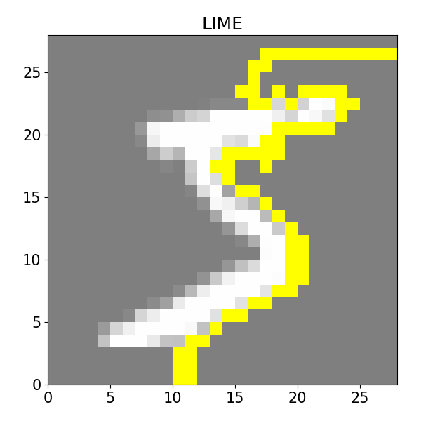
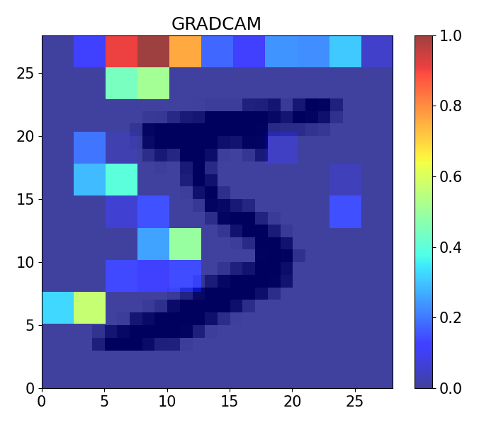
This example showcases 2-D capabilities of pudu. The example loads a pre-trained model for the classification of handwritten numbers from the MNIST dataset, alongside with LIME and GRAD-CAM visualizations.
import numpy as np
from tensorflow import keras
from keras.models import load_model
import matplotlib.pyplot as plt

from pudu import pudu, plots

# Model / data parameters
num_classes = 10
input_shape = (28, 28, 1)

# Load the data and split it between train and test sets
(x_train, y_train), (x_test, y_test) = keras.datasets.mnist.load_data()

# Scale images to the [0, 1] range
x_train = x_train.astype("float32") / 255
x_test = x_test.astype("float32") / 255

# Make sure images have shape (28, 28, 1)
x_train = np.expand_dims(x_train, -1)

# convert class vectors to binary class matrices
y_train = keras.utils.to_categorical(y_train, num_classes)
y_test = keras.utils.to_categorical(y_test, num_classes)

# Load the model and test it
model = load_model('examples/data/mnist_class.h5')
model.summary()
score = model.evaluate(x_test, y_test, verbose=0)
print("Test loss:", score[0], "| Test accuracy:", score[1])


### PUDU ###
# Input should be 4d: (batch * rows * columns * depth)
# This is a classification problem, thus the output should be the
# probability by category: [prob_1, prob_2, ..., prob_c]
def cnn2d_prob(X):
    X = X[0,:,:,:]
    return model.predict(np.array([X, X]), verbose=0)[0] # verbose 0 is important!

# Dimention standarization for parameters
y = np.argmax(y_train[0])
x = np.expand_dims(x_train[0], 0)

# Build `pudu`, evaluate importance, and plot
imp = pudu.pudu(x, y, cnn2d_prob)

# in this case, 'window' is a tuple that indicates the width and height.
imp.importance(window=(3, 3), scope=None, padding='center')
plots.plot(imp.x, imp.imp_rel, axis=None, figsize=(7, 6), cmap='cool', title='Relative Importance',
            xlabel='', ylabel='')

# In this case, as there are many `0` values in the image, including some bias
# can help us to visualize importance in those areas, since 0*delta = 0
imp.importance(window=(3, 3), scope=None, padding='center', bias=0.1)
plots.plot(imp.x, imp.imp_rel, axis=None, figsize=(7, 6), cmap='cool', title='Relative Importance - with bias',
            xlabel='', ylabel='')

### LIME ###
from lime import lime_image
from skimage.segmentation import mark_boundaries
from skimage.color import gray2rgb

# lime_image works with 3D RGB arrays. Our image is non-RGB. We transform it
# to RGB with gray2rgb which needs a 2D input.
image = x_train[0,:,:,0]
image = gray2rgb(image)

# model.predict is not for RGB, so we have to wrap it so the input is RBG.
def cnn2d_prob(X):
    X = X[:, :, :, 0]
    X = X[:, :, :, np.newaxis]
    return model.predict(X, verbose=0)

explainer = lime_image.LimeImageExplainer()
explanation = explainer.explain_instance(image, cnn2d_prob, batch_size=1, num_samples=1000)
temp, mask = explanation.get_image_and_mask(explanation.top_labels[0], positive_only=True, num_features=10, hide_rest=True)

plt.rc('font', size=15)
plt.subplots_adjust(left=0, bottom=0, right=1, top=1)
plt.figure(figsize=(6, 6))

plt.imshow(mark_boundaries(temp / 2 + 0.5, mask), extent=[0, 28, 0, 28])

plt.title('LIME')
plt.tight_layout()
plt.show()

### GRAD CAM ###
import numpy as np
import tensorflow as tf
from tensorflow import keras
from IPython.display import Image, display
import matplotlib.pyplot as plt
import matplotlib.cm as cm

def make_gradcam_heatmap(img_array, model, last_conv_layer_name, pred_index=None):
    # First, we create a model that maps the input image to the activations
    # of the last conv layer as well as the output predictions
    grad_model = tf.keras.models.Model(
        [model.inputs], [model.get_layer(last_conv_layer_name).output, model.output]
    )

    # Then, we compute the gradient of the top predicted class for our input image
    # with respect to the activations of the last conv layer
    with tf.GradientTape() as tape:
        last_conv_layer_output, preds = grad_model(img_array)
        if pred_index is None:
            pred_index = tf.argmax(preds[0])
        class_channel = preds[:, pred_index]

    # This is the gradient of the output neuron (top predicted or chosen)
    # with regard to the output feature map of the last conv layer
    grads = tape.gradient(class_channel, last_conv_layer_output)

    # This is a vector where each entry is the mean intensity of the gradient
    # over a specific feature map channel
    pooled_grads = tf.reduce_mean(grads, axis=(0, 1, 2))

    # We multiply each channel in the feature map array
    # by "how important this channel is" with regard to the top predicted class
    # then sum all the channels to obtain the heatmap class activation
    last_conv_layer_output = last_conv_layer_output[0]
    heatmap = last_conv_layer_output @ pooled_grads[..., tf.newaxis]
    heatmap = tf.squeeze(heatmap)

    # For visualization purpose, we will also normalize the heatmap between 0 & 1
    heatmap = tf.maximum(heatmap, 0) / tf.math.reduce_max(heatmap)
    return heatmap.numpy()


last_conv_layer_name = 'conv2d_5'
image = np.expand_dims(x_train[0], axis=0)

# Remove last layer's softmax
model.layers[-1].activation = None

# Generate class activation heatmap
heatmap = make_gradcam_heatmap(image, model, last_conv_layer_name)


plt.rc('font', size=15)
plt.subplots_adjust(left=0, bottom=0, right=1, top=1)
plt.figure(figsize=(7, 6))

plt.imshow(image[0,:,:,:], cmap='binary', alpha=1, extent=[0, 28, 0, 28])
plt.imshow(heatmap, cmap='jet', aspect="auto", alpha=0.75, extent=[0, 28, 0, 28])

plt.title('GRADCAM')
plt.tight_layout()
plt.colorbar(pad=0.05)
plt.show()
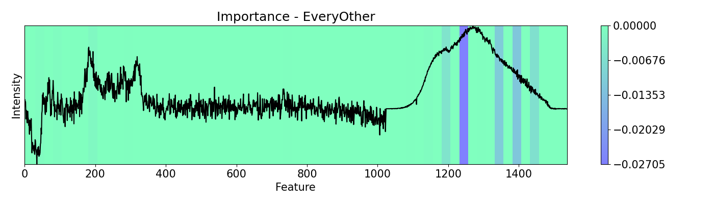
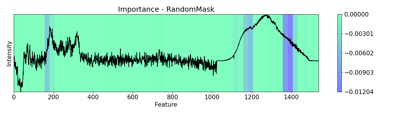
Example 4: How to call different masks
Masking allows you to cover features from the analysis. It serves the same purpose of scope but it works in a structured and patterned way. This example shows the use of mask options available with a PC-LDA model using Raman and Photoluminescence spectras merged into a single vector as features and performance as open circuit voltage (Voc) data as target for classification. These are measured from CIGSe photovoltaic cells from a combinatorial sample.
import spectrapepper as spep
import numpy as np
import pickle

from pudu import pudu, plots
from pudu import masks as msk

# Masking allows you to cover your featuresof analysis. It serves the
# same purpose of `scope` but it works ni a structured and patterned way.
# This example shows the use of `mask` options available.

# Load features (spectra) and targets (open circuit coltage, voc)
features = spep.load('examples/data/features.txt')
targets = spep.load('examples/data/targets.txt', transpose=True)[2]

# Load pre-trained LDA and PCA models
lda = pickle.load(open('examples/data/lda_model.sav', 'rb'))
pca = pickle.load(open('examples/data/pca_model.sav', 'rb'))

### PUDU ###
# Select x (feature) and respective y (target)
x = features[100]
x = x[np.newaxis, np.newaxis, :, np.newaxis]
y = targets[100]

# Input should be 4d: (batch * rows * columns * depth)
# This is a classification problem, thus the output should be the
# probability by category: [prob_1, prob_2, ..., prob_c]
def pf(X):
    X = X[0,:,:,0]
    return lda.predict_proba(pca.transform(X))[0]

# Build pudu
imp = pudu.pudu(x, y, pf)

# Evaluate `importance` with no mask first, then 'everyother' and 'random'
masks = [msk.All(), msk.EveryOther(), msk.RandomMask()]
m_names = ['All', 'EveryOther', 'RandomMask']
for i,j in zip(masks, m_names):
    imp.importance(window=25, absolute=False, mask=i)
    plots.plot(imp.x, imp.imp, title="Importance - "+j, yticks=[], font_size=15, cmap='winter')
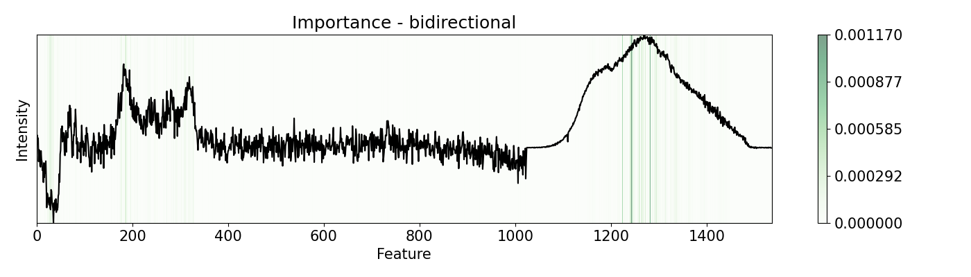
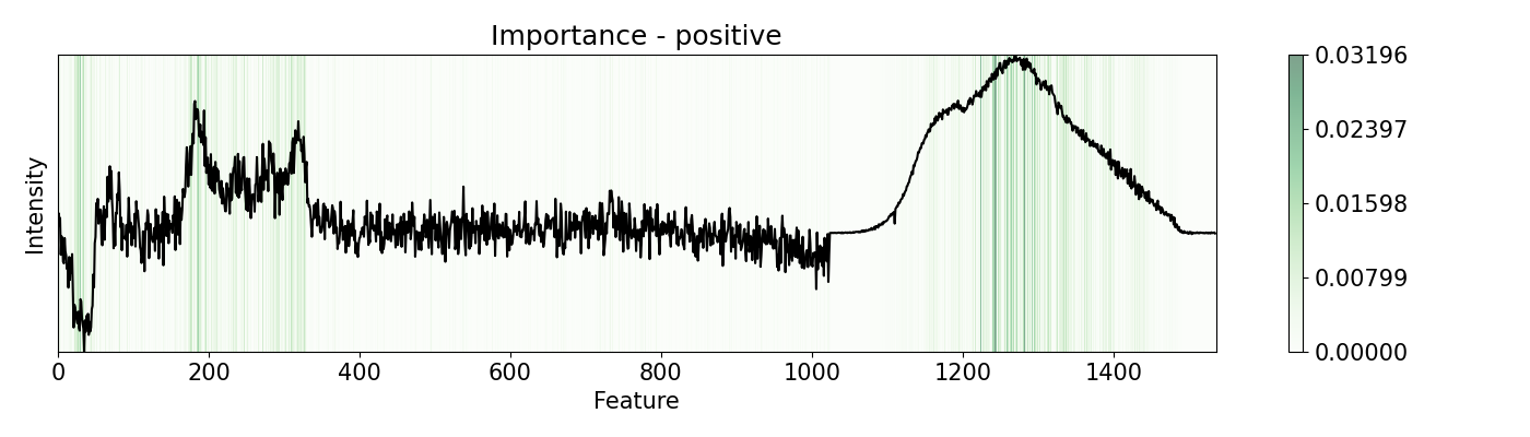
Example 5: How to call different perturbations
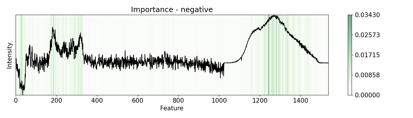
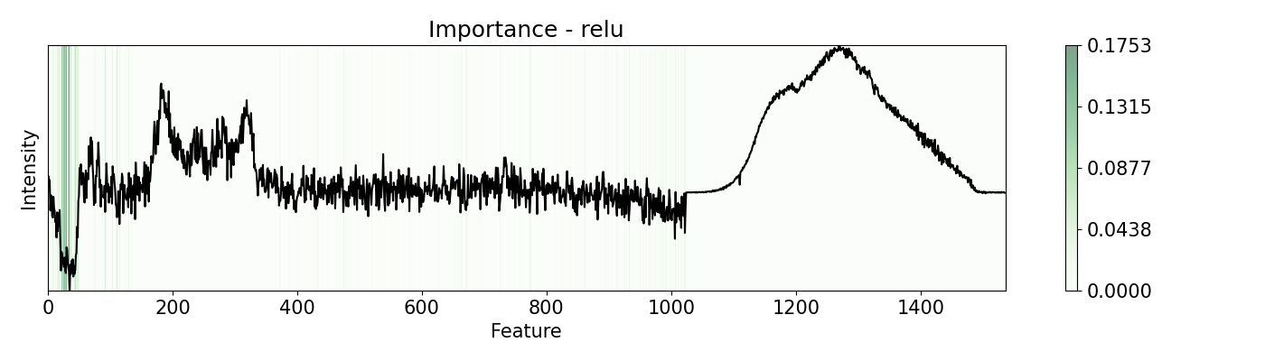
Depending on the nature of the data and the problem, different perturbation functions and patterns may be needed. pudu offers options to suit different scenarios. Some of the are shown in this example. This example uses a PC-LDA model that classifies Raman and Photoluminescence spectras merged into a single vector as features and performance as open circuit voltage (Voc) data as target. These are measured from CIGSe photovoltaic cells from a combinatorial sample.
import spectrapepper as spep
import numpy as np
import pickle

from pudu import pudu, plots
from pudu import perturbation as ptn


# Other examples are with `bidirectional` or `positive` mode, that
# is an average of changing positevly and neatively the feature by
# `delta` times. Depending on the nature of your features, you can
# diferent modes that will yield different results

# Load features (spectra) and targets (open circuit coltage, voc)
features = spep.load('examples/data/features.txt')
targets = spep.load('examples/data/targets.txt', transpose=True)[2]

# Load pre-trained LDA and PCA models
lda = pickle.load(open('examples/data/lda_model.sav', 'rb'))
pca = pickle.load(open('examples/data/pca_model.sav', 'rb'))

### PUDU ###
# Select x (feature) and respective y (target)
x = features[100]
x = x[np.newaxis, np.newaxis, :, np.newaxis]
y = targets[100]

# Input should be 4d: (batch * rows * columns * depth)
# This is a classification problem, thus the output should be the
# probability by category: [prob_1, prob_2, ..., prob_c]
def pf(X):
    X = X[0,:,:,0]
    return lda.predict_proba(pca.transform(X))[0]

# Build pudu
imp = pudu.pudu(x, y, pf)

# Evaluate `importance` with 'bidirectional', 'positive', 'negative', and 'relu'
# Note that some of these work only with `w=1`, like `relu` and `leakyrelu`
pert = [ptn.Bidirectional(), ptn.Positive(), ptn.Negative(), ptn.ReLU()]
ptn_names = ['bidirectional', 'positive', 'negative', 'relu']
for i,j in zip(pert, ptn_names):
    imp.importance(window=1, perturbation=i, absolute=True)
    plots.plot(imp.x, imp.imp, title="Importance - "+j, yticks=[], font_size=15)
Example 6: Re-activations with 1-D CNN
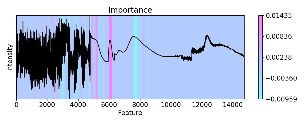
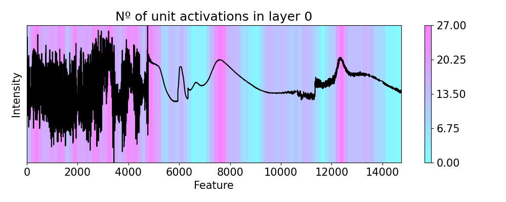
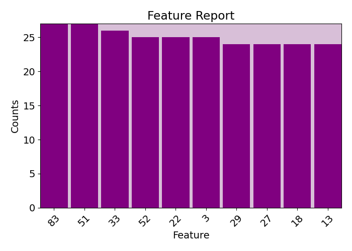
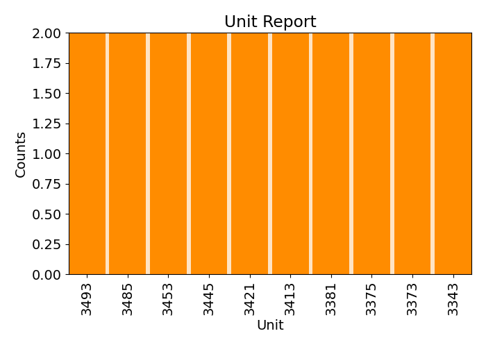
This example shows how to evaluate the ` re-activations < https://pudu-py.github.io/pudu/definitions.html#activations-and-re-activaiton>`_ on the activation maps for a CNN for classification of four Raman and four Photoluminescence spectras (eight in total) merged together into a single vector according to the open circuit voltage (Voc) of photovoltaic CIGSe samples. It also showcases the use of relate, feature_report, unit_report, and relate_report.
import numpy as np
from tensorflow import keras
from keras.models import load_model
import spectrapepper as spep
from pudu import pudu, plots
from pudu import masks as msk
from pudu import perturbation as ptn
# Scale images to the [0, 1] range
x = spep.load('examples/data/for_1d_cnn_c3.txt')
x = np.expand_dims(x, 2)
y = [3, 3, 3] # these are all class 3
# convert class vectors to binary class matrices
y = keras.utils.to_categorical(y)
# Load the model and test it
model = load_model('examples/data/1d_cnn.h5')
score = model.evaluate(x, y, verbose=0)
print("Test loss:", score[0], "| Test accuracy:", score[1])
model.summary()
### PUDU ###
# Input should be 4d: (batch * rows * columns * depth)
# This is a classification problem, thus the output should be the
# probability by category: [prob_1, prob_2, ..., prob_c]
def cnn1d_prob(X):
X = X[0,:,:,:]
return model.predict(np.array(X), verbose=0)[0] # verbose 0 is important!
# Dimension standardization for parameters
y0 = np.argmax(y[0])
x0 = np.expand_dims(np.expand_dims(x[0], 0), 1)
# Build `pudu`, evaluate importance, and plot
imp = pudu.pudu(x0, y0, cnn1d_prob, model)
# First we check importance
imp.importance(window=150, perturbation=ptn.Positive(delta=0.1))
plots.plot(imp.x, imp.imp, axis=None, figsize=(10, 4), cmap='cool')
# Now we explore the unit re-activations observed in layer 4 (last conv. layer)
# We only consider the top 0.25% of the values as activated with `p=0.0025`.
# Negative values indicate that less units are being re-activated.
imp.reactivations(layer=4, slope=0, p=0.0025, window=150, perturbation=ptn.Positive(delta=0.1))
plots.plot(imp.x, imp.lac, axis=None, figsize=(10, 4), cmap='cool',
title='Nº of unit activations in layer 0')
# There could be units that activate more frequently with changes in specific areas
# We can explore that too using the information obtained from 'activations'
# and generate a visual (and/or printed) report
plots.feature_report(imp.fac, plot=True, print_report=False, show_top=10)
plots.unit_report(imp.uac, plot=True, print_report=False, show_top=10)
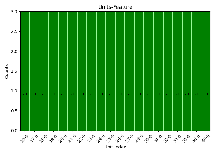
# We can extract more information when using several data points and `relatable`.
# This will check, after applying `reactivations` to N images, what units activate
# with what feature changes the most. This can be very computer-intensive. Here
# it only tests for 3 samples, but you will need a larger N to get significant
# results. If you can use a GPU it is highly advised to do so.
x = x.reshape(3, 1, 14730, 1) # Change the shape of the array
y = [np.argmax(i) for i in y]
imp = pudu.pudu(x, y, cnn1d_prob, model) # we need to build another pudu
imp.relatable(layer=2, slope=0, p=0.0025, window=200, perturbation=ptn.Positive(delta=0.1))
idx, cnt, cor = imp.icc # this outputs the unit index, activation counts, and position of the feature
plots.relate_report(idx, cnt, cor, plot=True, show_top=20, font_size=10, rot_ticks=45, sort=True)
Example 7: Re-activations with 2-D CNN
This example shows how to evaluate the re-activations on the activation maps for a 2D CNN. The example loads a pre-trained model for the classification of handwritten numbers from the MNIST dataset. It also showcases the use of relate, feature_report, unit_report, and relate_report.
import numpy as np
from tensorflow import keras
from keras.models import load_model
from pudu import pudu, plots
from pudu import perturbation as ptn
# Model / data parameters
num_classes = 10
input_shape = (28, 28, 1)
# Load the data and split it between train and test sets
(x_train, y_train), (x_test, y_test) = keras.datasets.mnist.load_data()
# Scale images to the [0, 1] range
x_train = x_train.astype("float32") / 255
x_test = x_test.astype("float32") / 255
# Make sure images have shape (28, 28, 1)
x_train = np.expand_dims(x_train, -1)
# convert class vectors to binary class matrices
y_train = keras.utils.to_categorical(y_train, num_classes)
y_test = keras.utils.to_categorical(y_test, num_classes)
# Load the model and test it
model = load_model('examples/data/mnist_class.h5')
score = model.evaluate(x_test, y_test, verbose=0)
print("Test loss:", score[0], "| Test accuracy:", score[1])
model.summary()
### PUDU ###
# Input should be 4d: (batch * rows * columns * depth)
# This is a classification problem, thus the output should be the
# probability by category: [prob_1, prob_2, ..., prob_c]
def cnn2d_prob(X):
X = X[0,:,:,:]
return model.predict(np.array([X, X]), verbose=0)[0] # verbose 0 is important!
# Dimention standarization for parameters
sample = 10
y = np.argmax(y_train[sample])
x = np.expand_dims(x_train[sample], 0)
# Build `pudu`, evaluate importance, and plot
imp = pudu.pudu(x, y, cnn2d_prob, model)
# First we check importance
imp.importance(window=(3, 3), perturbation=ptn.Positive(delta=0.1), bias=0.1)
plots.plot(imp.x, imp.imp_rel, axis=None, figsize=(6, 6), cmap='cool')
# Now we explore the unit activations observed in layer 2 (last conv. layer)
# We only consider the top 0.5% of the values as activated with `p=0.005`.
# Negative values indicate that less units are being activated.
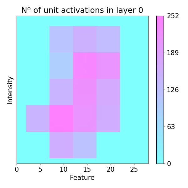
imp.reactivations(layer=2, slope=0, p=0.005, window=(5, 5), perturbation=ptn.Positive(delta=0.1))
plots.plot(imp.x, imp.lac, axis=None, figsize=(6, 6), cmap='cool',
title='Nº of unit activations in layer 0')
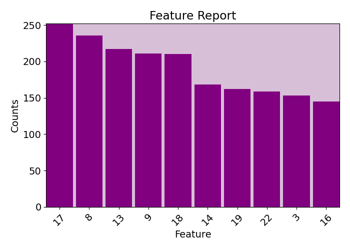
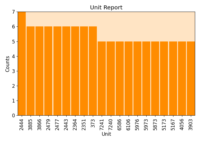
# There could be units that activate more frequently with changes in specific areas
# We can explore that too using the information obtained from 'activations'
# and generate a visual (and/or printed) report
plots.feature_report(imp.fac, plot=True, print_report=False, show_top=10)
plots.unit_report(imp.uac, plot=True, print_report=False, show_top=20, font_size=12)
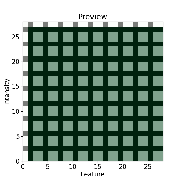
# To better visualize the coordinates, we can better check with 'preview'
imp.preview(window=(3, 3), figsize=(6, 6), yticks=None)
# We can extract more infomration when using several images and `relatable`.
# This will see, after applying `activations` to N images, what units activate
# with what features the most.
N = 10 # The more the better, 10 to keep computational times "low"
y = [np.argmax(i) for i in y_train[:N]]
x = x_train[:N]
imp = pudu.pudu(x, y, cnn2d_prob, model) # we need to build another pudu
imp.relatable(layer=2, slope=0, p=0.005, window=(3, 3), perturbation=ptn.Positive(delta=0.1))
idx, cnt, cor = imp.icc # this outputs the unit index, activation counts, and position of the feature
plots.relate_report(idx, cnt, cor, plot=True, print_report=True, show_top=30, font_size=10, rot_ticks=90, sort=True)

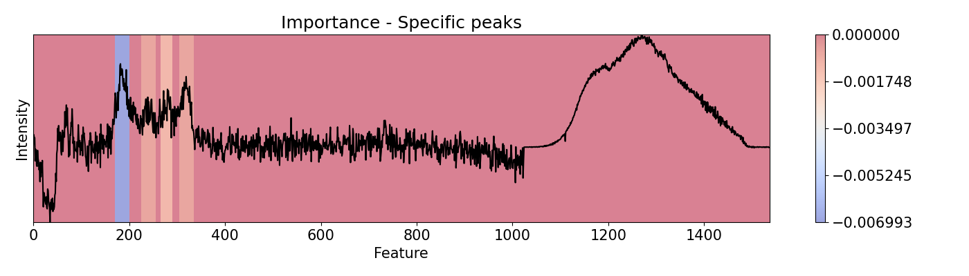
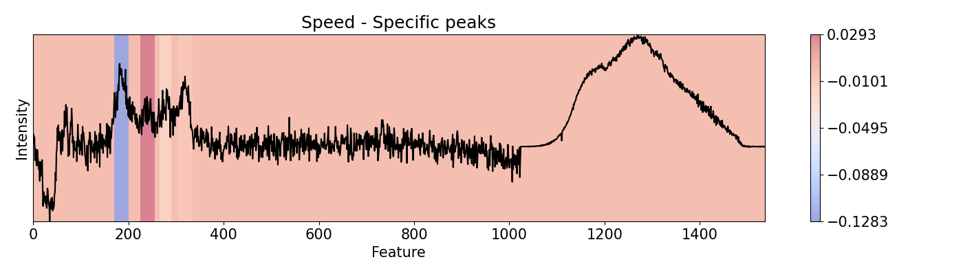
Example 8: Selecting specific sections to evaluate
To evaluate specific areas, peaks, and ranges, it is possible to be done one-by-one and then put them all together in a vector for plotting and/or normalizing. This can be performed for importance and speed. This example loads a pre-trained PC-LDA model built with Scikit-learn for classification of Raman and Photoluminescence spectras merged into a single vector as features according to performance as open circuit voltage (Voc).
import spectrapepper as spep
import numpy as np
import pickle

from pudu import pudu, plots


# Load features (spectra) and targets (open circuit coltage, voc)
features = spep.load('examples/data/features.txt')
targets = spep.load('examples/data/targets.txt', transpose=True)[2]

# Load pre-trained LDA and PCA models
lda = pickle.load(open('examples/data/lda_model.sav', 'rb'))
pca = pickle.load(open('examples/data/pca_model.sav', 'rb'))


### PUDU ###
# Select x (feature) and respective y (target)
x = features[100]
x_len = len(x)
x = x[np.newaxis, np.newaxis, :, np.newaxis]
y = targets[100]

# Input should be 4d: (batch * rows * columns * depth)
# This is a classification problem, thus the output should be the
# probability by category: [prob_1, prob_2, ..., prob_c]
def pf(X):
    X = X[0,:,:,0]
    return lda.predict_proba(pca.transform(X))[0]

# Build pudu
imp = pudu.pudu(x, y, pf)

# To evaluate more specific areas, we can do ir one-by-one and the
# put them all together in a vector for plotting and/or normalizing.
# This can be done for `importance` and `speed` only.

# For this, we first define the areas of interest
areas = [[170, 200], [225, 255], [265, 290], [305, 335]]

# In a loop we evaluate them individually. We make sure that `window`
# and `scope` are equal so all the area is evaluated. The results are
# saved in `custom`.
custom = np.zeros(x_len)
for i in areas:
    imp.importance(window=int(i[1]-i[0]), scope=(i[0], i[1]))
    custom[imp.imp[0, 0, :, 0] != 0] = imp.imp[0, 0, imp.imp[0, 0, :, 0] != 0, 0]

custom = custom[np.newaxis, np.newaxis, :, np.newaxis]
plots.plot(imp.x, custom, title="Importance - Specific peaks", yticks=[], font_size=15, cmap='coolwarm')

# Repeat the same for `speed`.
custom = np.zeros(x_len)
for i in areas:
    imp.speed(window=int(i[1]-i[0]), scope=(i[0], i[1]))
    custom[imp.spe[0, 0, :, 0] != 0] = imp.spe[0, 0, imp.spe[0, 0, :, 0] != 0, 0]

custom = custom[np.newaxis, np.newaxis, :, np.newaxis]
plots.plot(imp.x, custom, title="Speed - Specific peaks", yticks=[], font_size=15, cmap='coolwarm')